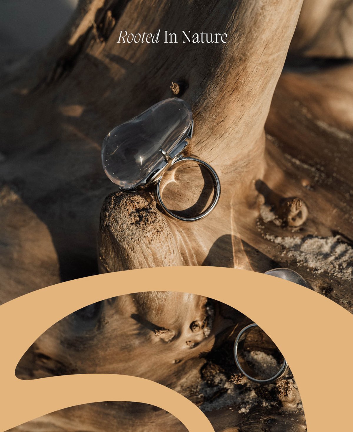
The Harmony Of Form And Feeling
Brand Research / Brand Strategy / Storytelling / Tone of Voice / Identity Design
Aura, a premium jewellery brand, sought to establish a unique brand identity that would resonate with its audience on a deep emotional level. The challenge was to create a cohesive visual language that reflected Aura's essence – a blend of romance, tranquility, and elegance – while also embodying a sense of confident humility.
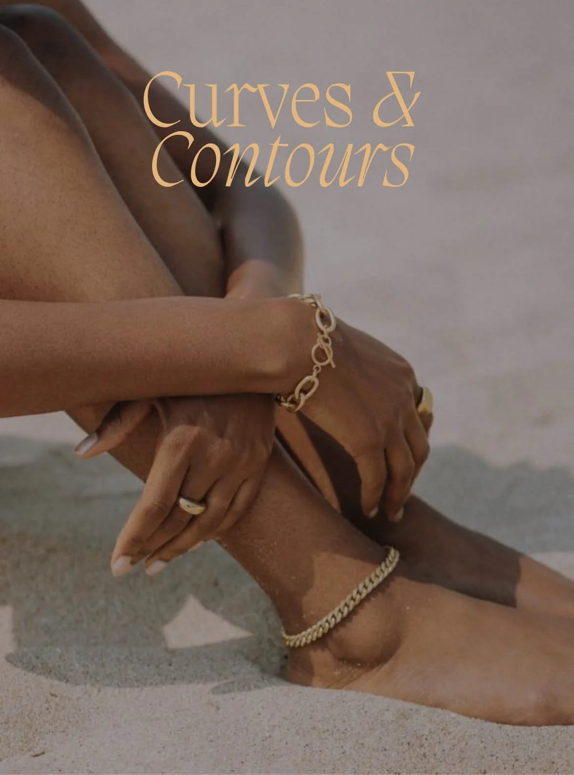
The strategy for Aura was rooted in the belief that true beauty is not loud or boastful but rather quietly confident and inherently humble. To convey this message, I focused on warm, inviting colour tones, elegant typography, and fluid graphical elements. These elements were carefully selected to evoke feelings of warmth, grace, and approachability, inviting the audience to explore the world of Aura with confidence.

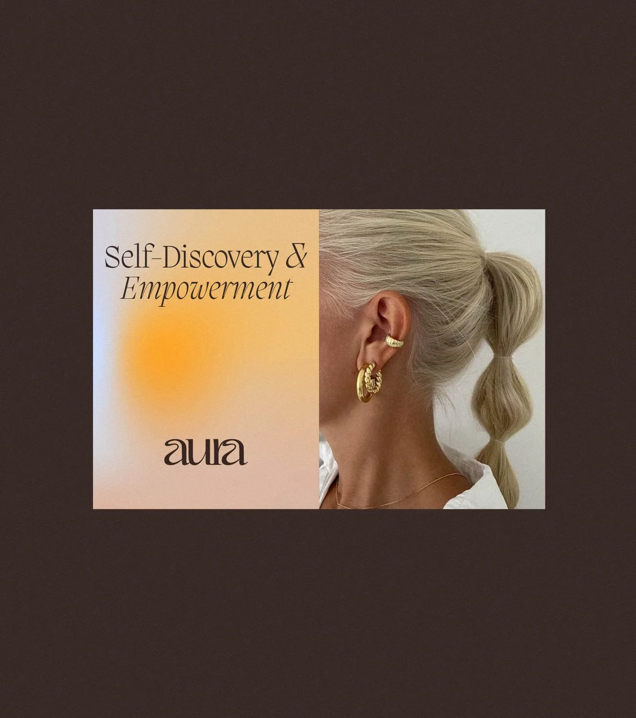

Drawing inspiration from nature's own artistry, I crafted a brand identity that celebrated the fluidity and elegance of organic shapes. The logo, with its graceful typography and soft gradients, served as the cornerstone of Aura's visual identity, while warm, earthy tones added depth and warmth to the overall aesthetic. Fluid graphical elements further enhanced the brand's sense of dynamism and vitality, reinforcing the message of confident humility.