Creating an Elegant Identity for a Luxury Stone Masonry Brand
Brand Research / Brand Strategy / Storytelling / Identity Design / Campaign
J. Rotherham stands prominently as one of the leading worktop manufacturers in the UK – distinguished by a legacy of quality, authenticity and a commitment to creating luxury surfaces. Whilst their reputation was continuing to grow, the presentation of the brand felt dated and they approached us with a vision to modernise and revitalise.
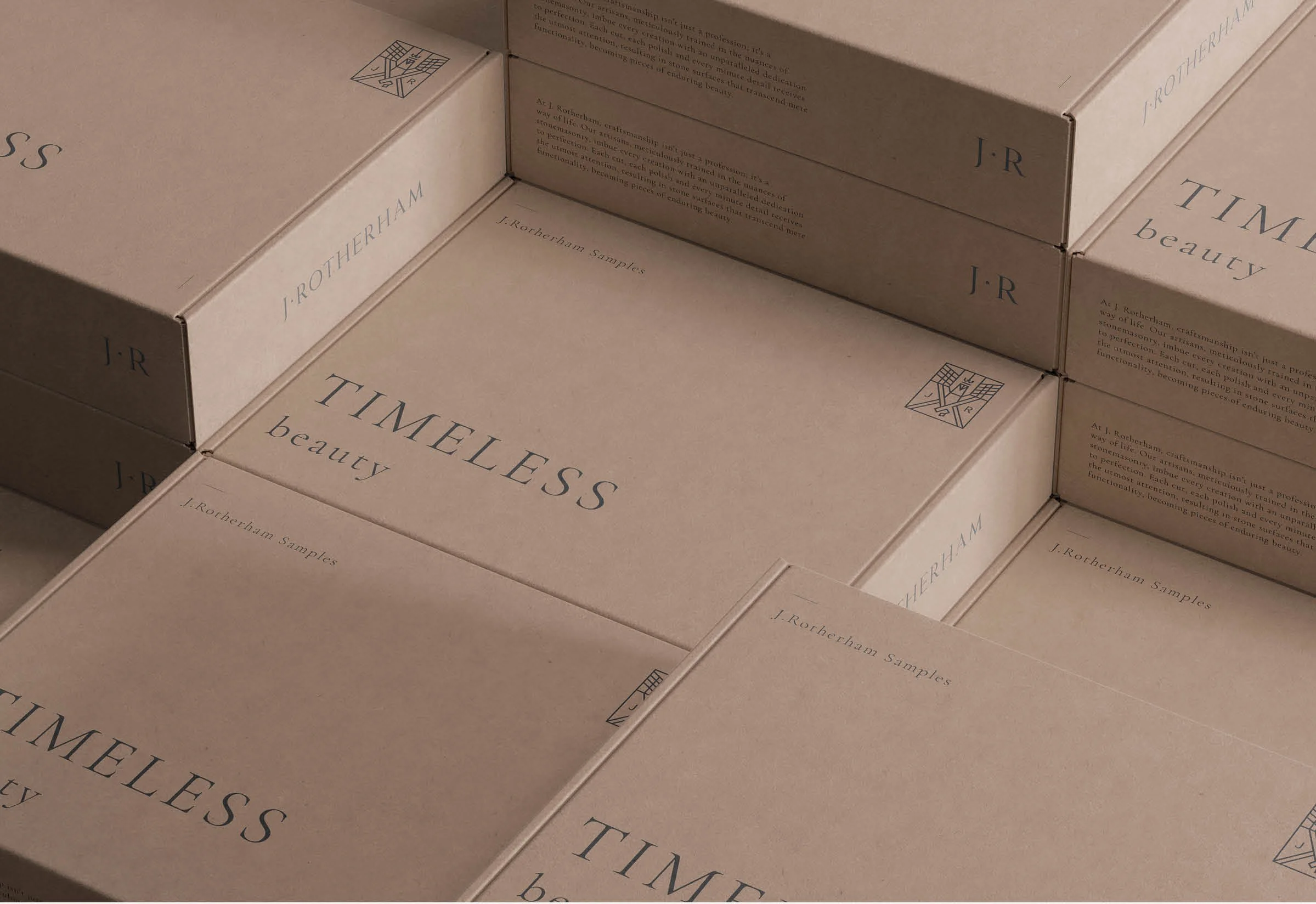
Beginning with a strategic overhaul of J. Rotherham's visual identity, we brought a modern expression to the brand, conveying the inherent excellence of its products as well as bringing clarity to its diverse product portfolio. Their symbol, the griffin, which had been synonymous with the brand throughout their history underwent a transformative evolution, emerging as a sleek, modern emblem.
*The work presented on this page was created during my tenure at Foretell Studio.


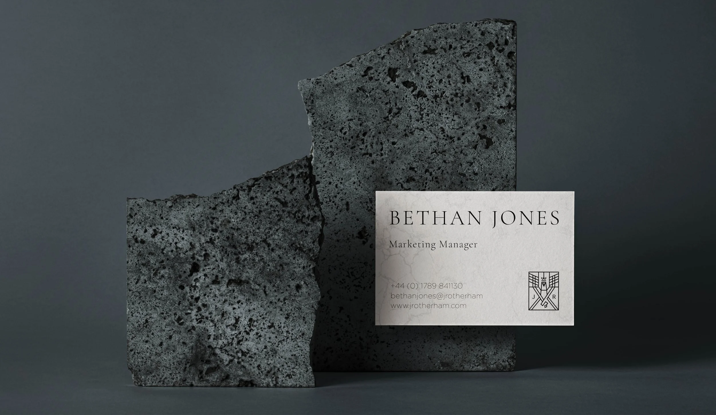
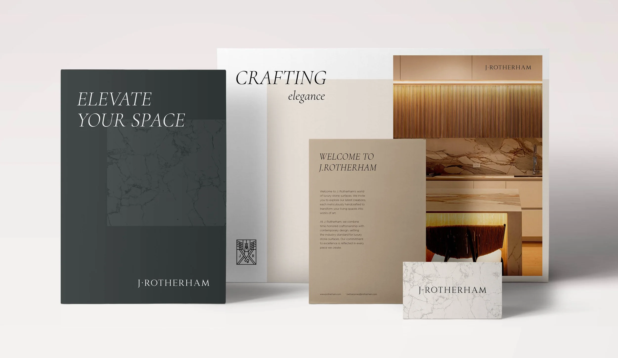
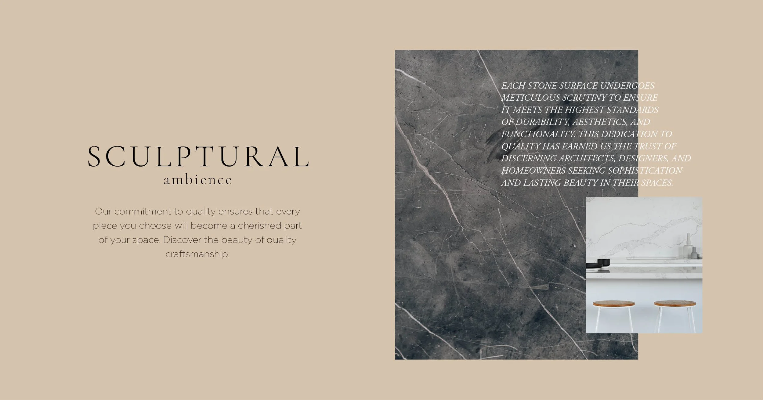
The transformation went beyond the logo and other brand elements. Through the creation of a timeless colour palette coupled with elegant typography and modernised graphical elements, a sense of character was instilled into the brand across all touch-points.
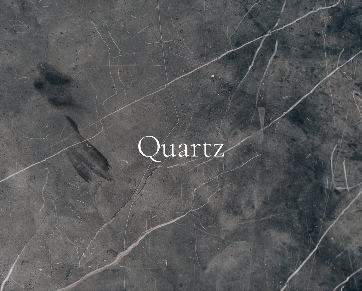
This strategic redesign allowed the product photography to shine, placing the craft and skill at the forefront of the brand, infusing the visual language with the sophistication the brand had come to embody.